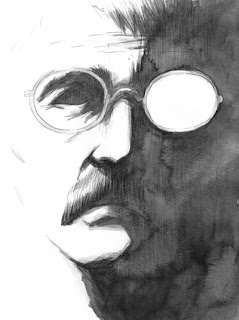
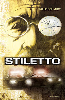
The cover of my upcoming graphic novel STILETTO has a long and interesting story.
The basic idea is stolen from the poster for one of my favorite movies, Sam Peckinpah’s 1970 thriller Straw Dogs. I wanted the title to go over the mouth of the character, so suggest secrecy I guess. I go on intuition a lot.
I made the first shot at the cover years ago, maybe around 2009. I found a wall structure that I applied to the image, inspired by people like Dave McKean and his cover work from the 80s and 90’s. I was pretty pleased with the result.
But I made the mistake of asking some people for their opinion. And you know what happens, when you ask someone for their opinion, right? They give it to you.
“Is that Ghandi?”
“He looks like a 70-year old. Is that on purpose?”
It was not on purpose. And he’s not Ghandi. More like the opposite, really.
So I made some new shots at it, but was never really pleased with any of the results.
I used the cover I already had for a 40 page sample I had printed up to show around at conventions and stuff. I knew I was going to change it at some point, but it was good enough for the purpose.
Fast forward a couple of years, where I spent my time doing other projects and studying at the Danish Film School. I finally got back to STILETTO late 2012 and finished the book in March of 2013. Hooray!
But the cover still needed to be done. I had o do something about Ghandi, and add some more cop/thriller elements and a new logo, which had come after the original. I used some reference pictures of Paul Newman and made several new versions, still not quite happy about it.
When I was applying the strucure, things really turned sour. I couldn’t remember what mode I had set the layer in originally, and whether it was on top or below the image layer. I couldn’t get the color to look right, partly because the image in my head of how it should look, had been locked in my head from the first cover I did.
A lot of layers where added, a lot of Photoshop fiddling. Not happy.
I ended up going back to the original cover. I had to edit out the title, because I screwed up and flattened the image before saving. So some clones stamp tool was applied, also to remove a few wrinkles. I realized I didn’t care if people thought he looked old. He feels old. So it all fits.
Sometimes sticking to your original idea is the best thing you can do. Sometimes not. Anyway, here is the FINAL cover, the one I like best:
I’d love to hear your opinion – especially now, since it’s too late to do anything about it! Which version do you prefer?


I agree with you Palle. I think that final cover is best. Public opinion is great, but you can't live and die by it. You can–and SHOULD–take it under advisement, only. You have to keep true to your vision.
I never saw Ghandi in this, by the way, and think it's a solid concept from the start.
Thanks, Jeff! Yeah, the downside of asking for people's opinion is that they give it to you. Glad you liked the same one I did!