Part 3: Shark Sequence
What’s the first color you think of, when you think of a cop drama?
Blue, right?
So I decided I wouldn’t use blue in at all. I started doing the book in monochrome, yellowish-grey tones, with the plan to go over it again on the computer. But having done the first few pages, I realized there wasn’t much need. My coloring is now more like color correcting, tweaking an image here or there or adding a sudden splash of red or green, just to keep the readers on their toes. The yellowish tones help give the feeling of a dusty, smog-filled south-european city, and a morally unclear environment. There isn’t much black and white in this story, only shades of grey.
And yes, I do use blue. But only as flashbacks, dream sequences and cut-aways. By tinting a panel blue, the reader can quickly gather that the action is not happening here and now. I use color to tell the story, to help the reader navigate through the panels, drawing attention to only what’s important. And sometimes, just to throw them off track, I draw attention to something completely unimportant. Ever hear of red herrings?
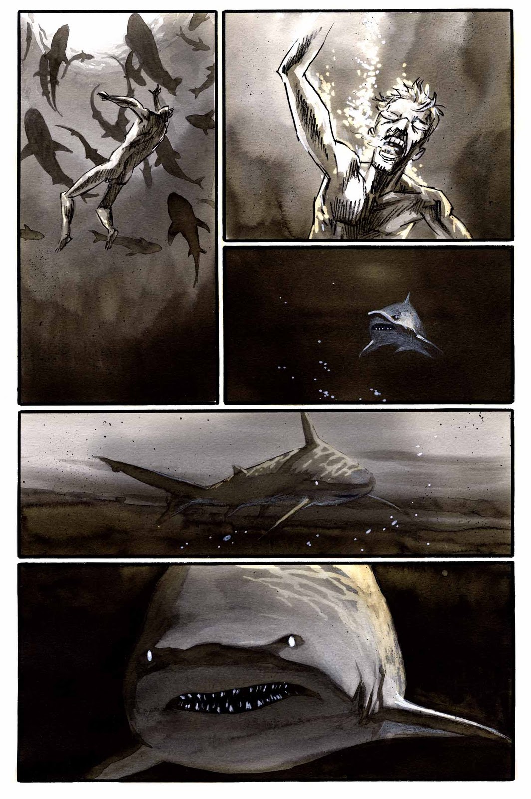
Anyway, here is a dream sequence done in grey tones, and tinted at the click of a button in Photoshop. If you ask nicely, I’ll tell you which button.